

Welcome to Book Passion for Life's 29th US vs UK book cover battle. We've seen this posted on a few other blogs, and thought we'd jump on the band wagon!
The idea of this battle is once a week we'll post 2 sets of books of our choice, one US cover and one UK cover, and we'll just give our opinion on which one we love the most. Which cover captures the story, which one would catch our eye if we saw it on the shelf in a shop. The US cover will be on the left, and the UK cover will be on the right.
The Scores so far are:


Jess says: Hmm, I think I'll go with the US cover. I do like the pink on the UK cover, but I don't get why the people are like that? It's odd. The US cover just stands out a lot more for me.
Donna says: I can't wait to read this book but the covers, I have to say US wins for me. I actually really like the UK cover but I don't like the way the people look. I love the pink colours they've used but I think with the person on the US and the different blues...the US stands out that much more.
Touch of Power by Maria V Snyder
 vs
vs 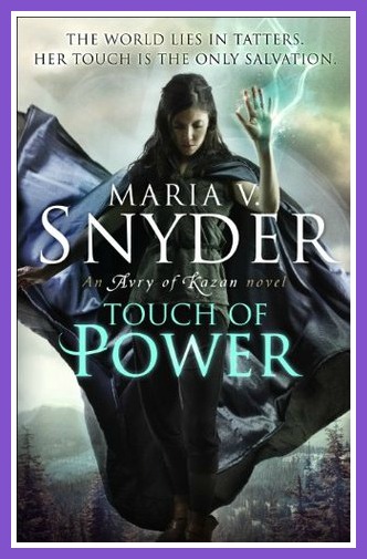
Jess says: Pfft...no contest. The US wins this one. Everything about it is beautiful. The UK cover is just...mehhh...dull. US is just stunning and I would pick it up if I saw it on the shelf.
Donna says: No contest here! US wins! I love, love, love it! So gorgeous, bright and colourful. Where as the UK cover is really boring and bland. US for me!
Which do you prefer?
__________________
Okay guys, this weeks US vs UK goes to....US!
Come back next week for more US vs UK! :)


10 comments:
Oh oth covers for under the never sky are pretty but I think I'll go us to cuz the people look weird on our one.
I pick uk for touch of power though, I like e lightening and she's floating! And it really fits in with her other uk covers :)
I love the US cover of Under the Never Sky. It's gorgeous. The UK cover is still pretty, but there's something about the sky and the girl on the US cover that appeals to me more.
For Touch of Power I'd go with UK because she actually looks powerful. For the US cover it looks too fantasy-like, but it's still beautiful.
Shana @ Sizzling Reads
I usually prefer the UK covers, but this week it's US all the way! The cover for "Under the never sky" is just so gorgeous and mysterious, it makes me want to lose myself in the story and the cover for "Touch of power" seems to tell a story all on its own!
The US Touch of Power is stunning! It's making me want to import that cover (since I live in UK). Easy choices this week for me- Both US :)
US covers win my vote for both!
I like the US cover too but FYI I saw on Veronica Rossi's site last week that the cover for the US edition has been "updated".... The look is a little more "dynamic": the title letters were simplified and the colors behind girl in the cover are brighter
US for both!
I love the US cover for Under the Never Sky, I love the light effect behind the girl.
For Touch of Power UK gets my vote. I like it so much more than the US one.
I agree with you girls - US rulezz!
US for Under The Never Sky, UK by a slight margin for Touch of Power
Post a Comment