

Welcome to Book Passion for Life's 18th US vs UK book cover battle. We've seen this posted on a few other blogs, and thought we'd jump on the band wagon!
The idea of this battle is once a week we'll post 2 sets of books of our choice, one US cover and one UK cover, and we'll just give our opinion on which one we love the most. Which cover captures the story, which one would catch our eye if we saw it on the shelf in a shop. The US cover will be on the left, and the UK cover will be on the right.
The Scores so far are:
US: 6 UK: 6 Draw: 6
US vs UK Round 18
 vs
vs 
Haley says: hmm, this one is a tough one! They are both pretty simple covers, but I think I like the UK one more, I really like how the red branches form a heart, but besides that like Donna said, they're both pretty plain, UK gets my vote!
Donna says: Erm...well...neither is really appealing to me but if I had to pick, I'd go with the UK cover. The black stands out a lot more than the white and frankly, the US cover is really boring....there's nothing to the cover. Has anyone seen the hardback cover of this book? With the women on and the blue, its lovely....so I don't know why they didn't use that. Anyway, UK for me.
Which do you prefer?
_______________________
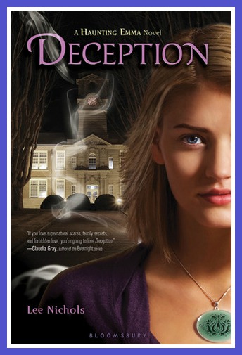
Deception by Lee Nichols
 vs
vs 
Haley Says: UGH I hate to say this, but UK again for me! I have seen the US cover in person, and it just really isn't that appealing. It's kinda cheesy looking in person. Now the UK cover though, SO pretty!!! I love how its almost the same cover, but the smokey effect they added over the picture really made the difference! So beautiful, UK gets my vote!
Donna Says: I thought this would be a good one to use seems as I just got it to review. Now the covers, they're both kind of similar, however the colours are completely different and this is what makes my choice for me.....UK wins! I The UK cover looks kinda creepy with the blue added on the front, I assume they've tried to make it look like mist and in my opinion it works. I love it. Oh and I love the white tree design too :)
Which do you prefer?
__________________
Okay guys, this weeks US vs UK goes to.....UK with 4 votes.
Thank you for joining us this week Haley! More US vs UK next week ! :)


367 comments:
«Oldest ‹Older 401 – 367 of 367Post a Comment